Panther – Field Data Vibration Test Replication Software
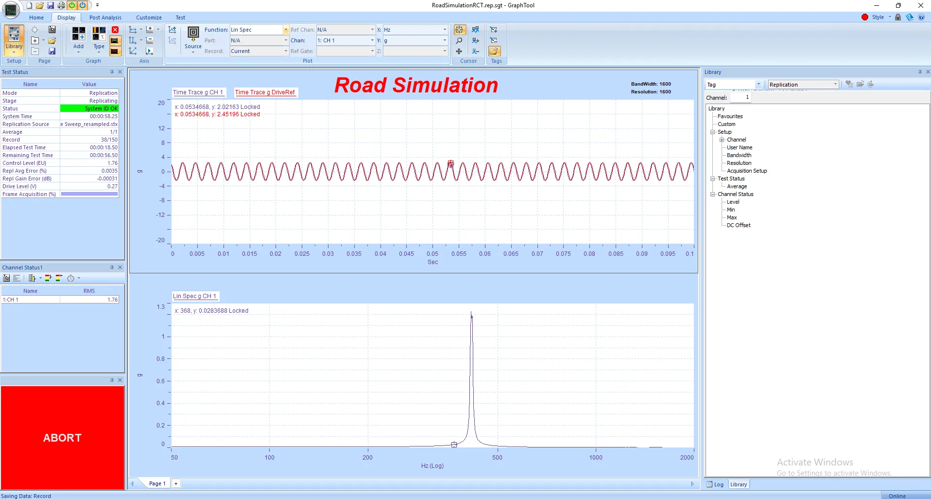
Panther Field Data Replication Control delivers precision and performance in time-domain waveform...
 Custom status panels in Panther are incredibly flexible.
Essentially, they allow you to create your own tailored displays to monitor specific data parameters during a test. Instead of being limited to predefined panels, you can choose exactly what information you want to see, how you want to see it, and arrange it all in a way that makes the most sense for your particular test setup.
They're useful because they let you:
• Focus on the most critical data points for your specific test, reducing clutter.
• Visualize data in various formats like text, X-Y graphs, bar graphs, or gauges.
• Combine data from different sources into a single, consolidated view.
• Create customized layouts that can be saved and recalled, speeding up setup for repeat tests.
For instance, imagine you're running a complex test with many channels. You could create a custom status panel that only shows the RMS, Min, and Max values for a select group of channels that are most critical to your test's success, displayed as gauges. This way, you can keep a close eye on those key parameters without being overwhelmed by data from channels that aren't relevant at that moment.

Panther Applications
Panther Field Data Replication Control delivers precision and performance in time-domain waveform...

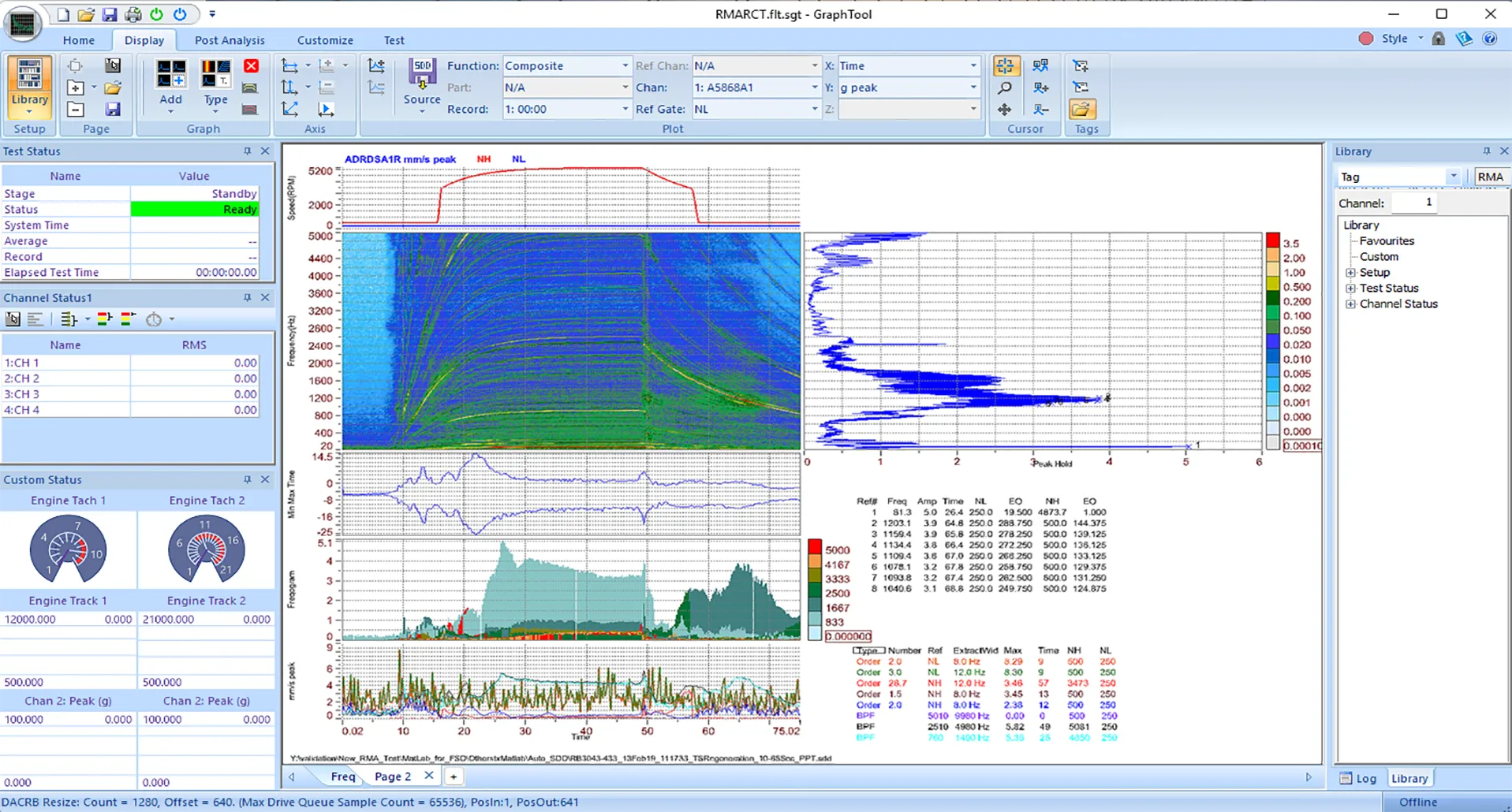
Panther Analyzer extends the power of Spectral Dynamics' next-generation Panther platform with...
Spectral Dynamics invented closed-loop digital vibration control and continues to lead with...
Spectral Dynamics invented closed-loop digital vibration control and continues to innovate with...
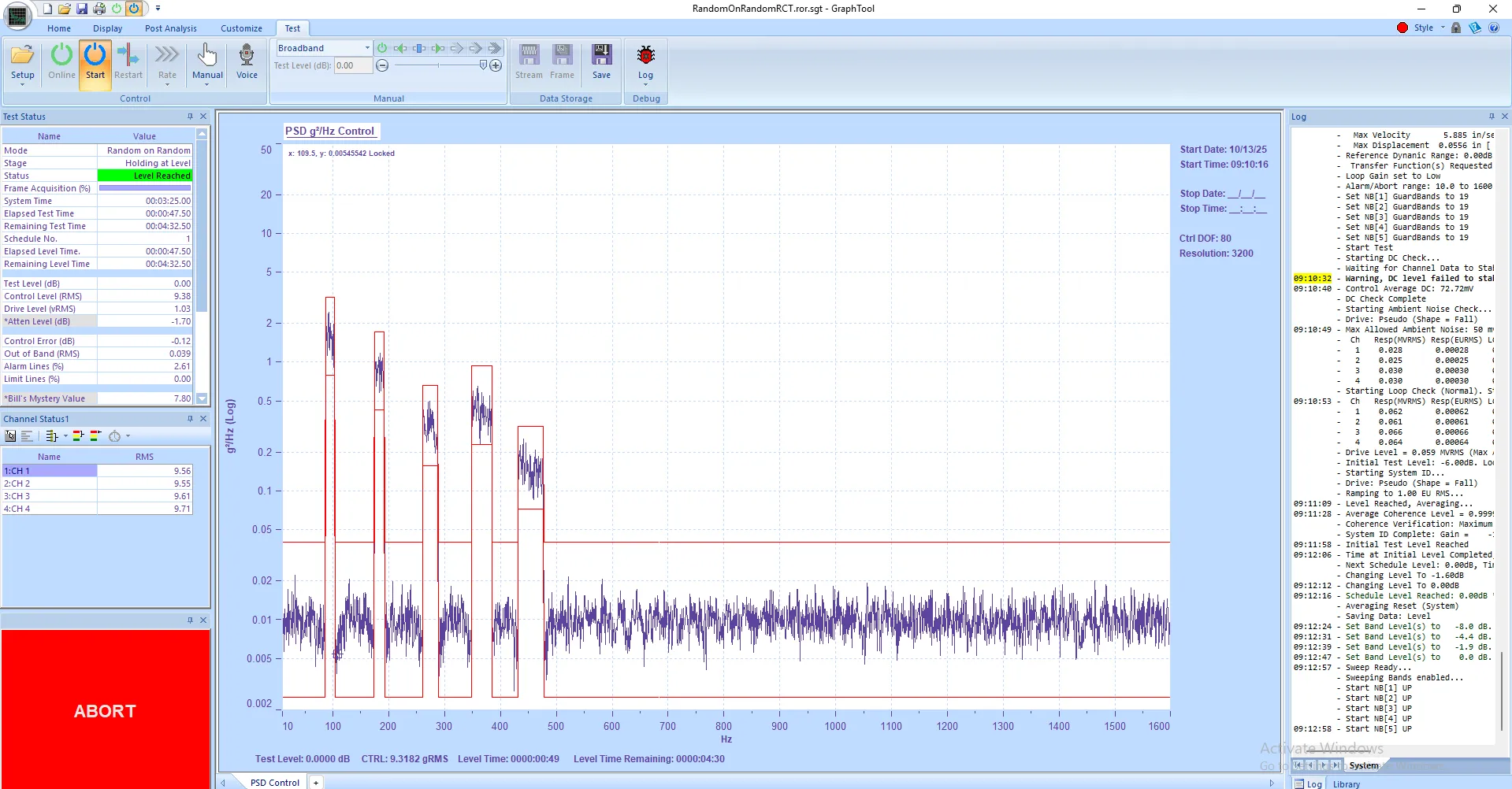
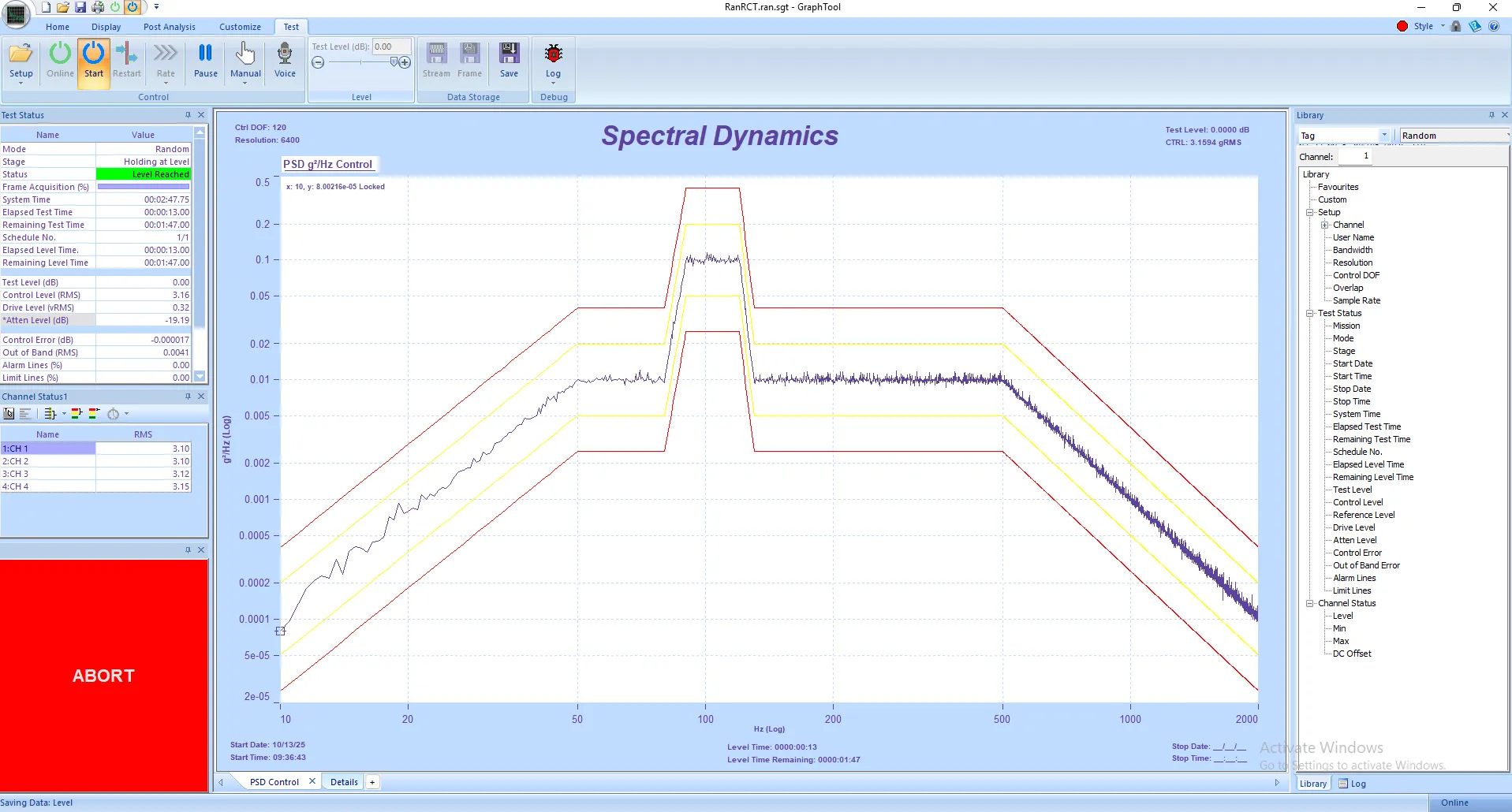
Panther Random on Random Control delivers precision and performance in multi-environment vibration...
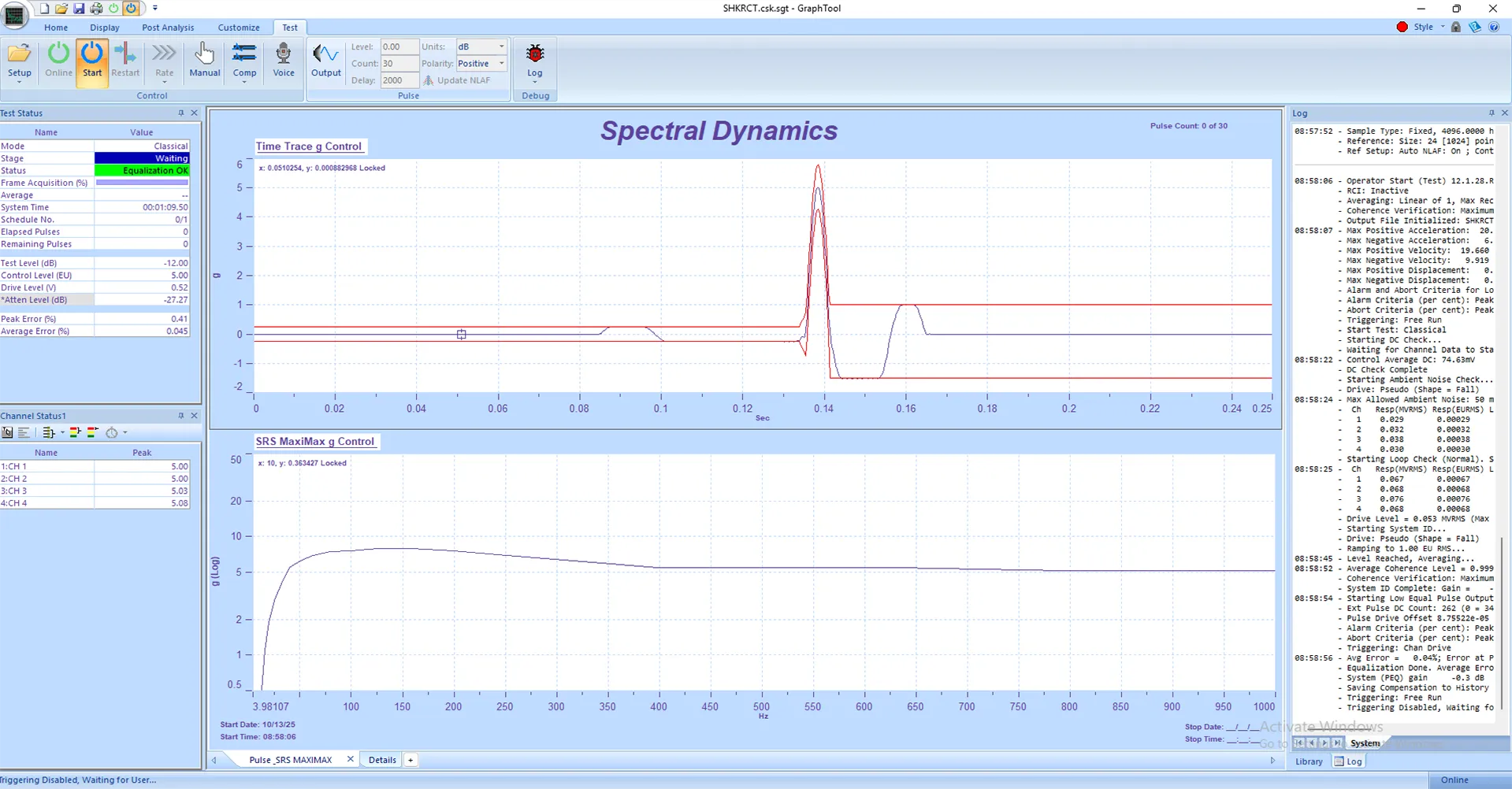
Panther Shock Control delivers precision and performance in transient vibration testing. Built on...
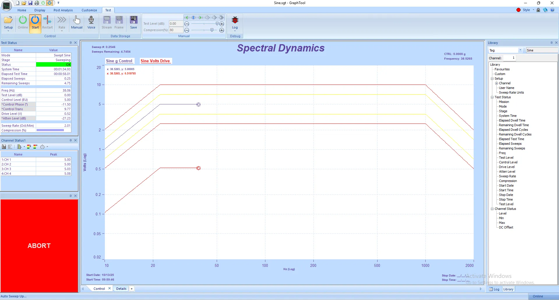
Panther Sine Control delivers unmatched precision and stability for both swept-sine and...
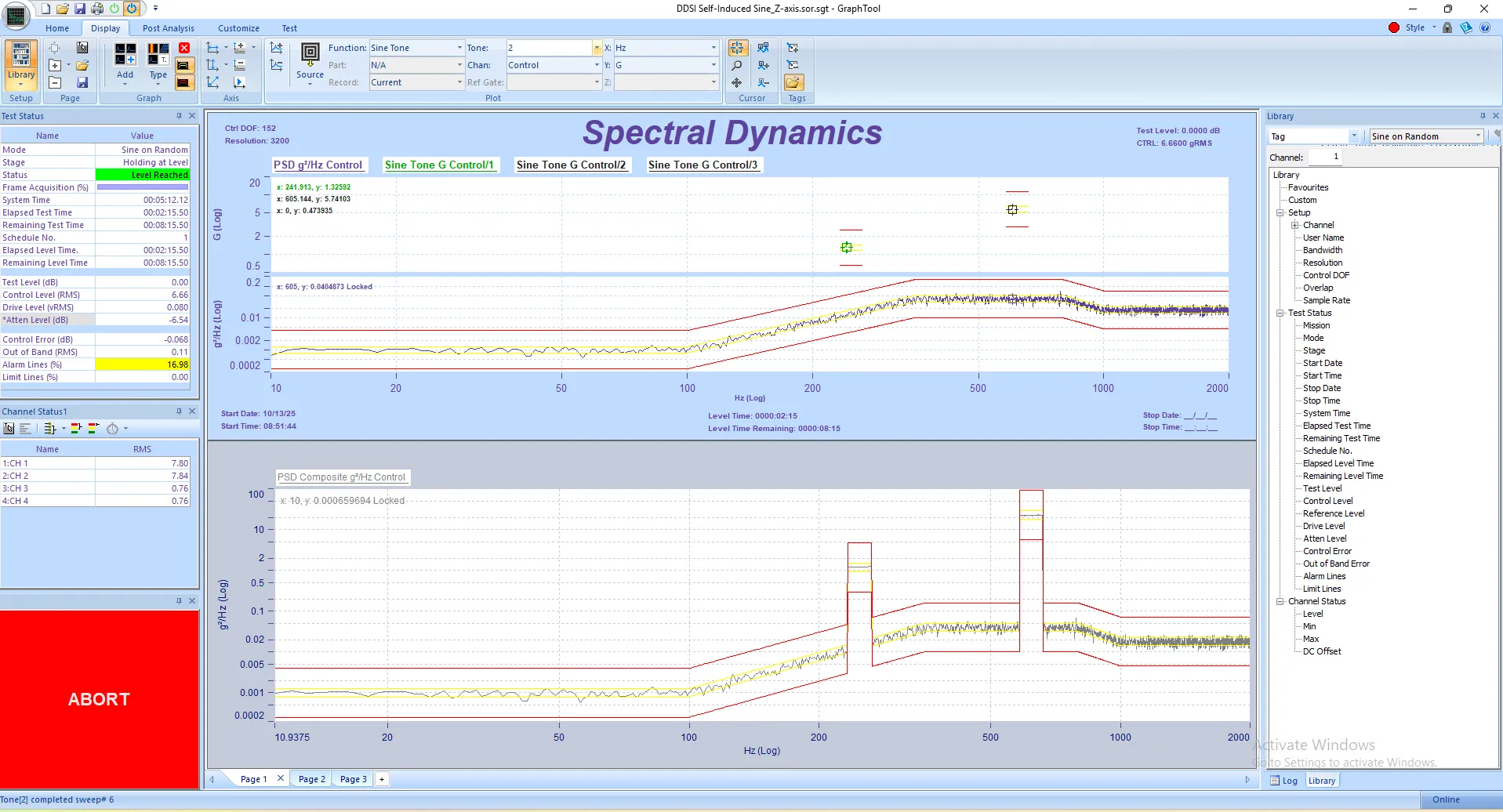
Panther Sine-on-Random Control delivers precision and performance in mixed-mode vibration testing....
![]()
![]()
![]()